Contrasting the ideas presented in these two books is a challenge. The reason for that is the two books have minimal areas of overlap. True, they both talk about design but "Emotional Design" does not cover the same sort of information that "Design of Everyday Things" does.
The first chapter of "Emotional Design" spent a lot of time talking about how positive emotions help the user understand how a new device works easier and the ways in which emotions are derived in humans and other animals. In comparison, "Design of Everyday Things" describes how the users are not at fault when they do not understand the design and the ways in which knowledge is available for the users. As you can see, the topics are similar but do not exactly relate to one another.
My personal opinion is that there is no simple way to contrast these two ideas. They are not opposing sides of a coin, but two seperate coins. Both must be included to have a complete and fully understood design. The layout needs to be asthetic (allowing for good emotions) and functional (containing all the necessary particulars).
Attractive things will allow the user to understand how they work much easier, but well designed items mean that the user will not have to think to understand how the item works. While both pieces are necessary for the a good design, there is a slight tradeoff. An emotionally designed object may have labels which a well designed object would not need. Do you want to make an emtionally designed object, or a well designed object? There should not be a tradeoff between which design style is better; both are necessary.
Sunday, September 30, 2012
Wednesday, September 19, 2012
Assignment #2: The Design of Everyday Things
Chapter 1: "The Psychopathology of Everyday Things"
This chapter gave a huge number of examples to help describe the information being presented. I realised as I was reading this book that I have used and had problems with a vast number of the examples provided for bad designs. It actually shocked me to think about the number of things that could be displayed so much simpler, in ways that would actually make sense. This started to make me think, I know that keyboards were designed with a specific purpose in mind, but if that is the case, why are some of the most commonly used letters in some random places? Also, what particularly decided the location of the symbols associated with the numbers on the top row of buttons? I assume it was random, but could they be better designed and why can't the user decide which symbols to place there? I use a variety of symbols that are not available on the keyboard at any point in time. The repeated example of the phone displayed some of the problems with expanding previous designs. The previously designed phones have an obvious impact on the newer designs. Thus, the designers must try to keep the design similar and still add the necessary items. Hopefully the new designs do not reach the state of needing an engineering degree to figure them out.
Chapter 2: "The Psychology of Everyday Actions"
This chapter spent most of the time talking about how the users will blame themselves for failures of the designer. I know the watch example is well and truly covered in the book, but this made me think about my father's digital watch. It has two buttons on the front and he is unable to determine how to make the alarm stop going off daily. It is not a failing on his part, but he simply passes the watch to me and says "make it stop." This makes me wonder if there are other technologies, like a digital watch, which are designed for everyone, but only those of a younger generation are likely to use. Cell phones for example, how long did it take for your parents to start texting? Mine didn't learn how to text regularly until I was two years into college. How many designs are simple for the youth to understand but incredibly complicated for the older generations? As people we need to demand devices which anyone can simply use and are easy to understand.
Chapter 3: "Knowledge in the Head and in the World"
This chapter covered the differences between having the knowledge of something stored in your memory vs being visible in the world. It also talked about how constraints can make it a lot easier to remember items and the types of memory and how they are different. I found this chapter particularly hard to read because a majority of this information is already covered in an intro to psychology class. Beyond that, the topic was relatively interesting. I had never considered the amount of information which is displayed in the world as compared to that which I keep in my head. Unfortunately, I had a stove which was going to be on my bad design list, which after this chapter will not be. I found Norman's comments about wanting a portable computer that attaches to a phone rather interesting, I believe that we have not met his thoughts that there would be a perfect version of this in 10 years. Eventually we will get a smart phone that is "perfect" for everyone.
Chapter 4: "Knowing What to Do"
This chapter covers some of the most common errors to occur from confusing affordances as well as the ways in which constraints can be used to depict only the correct solution. The example of the Lego police motorcycle clearly demonstrated how correctly designed objects can be constructed without worry about the pieces being combined incorrectly. Because of this I started to realize how almost every time my family and I are putting some piece of furniture together, we end up placing a piece in backwards or just plain wrong. Is it possible that we are not the only ones to have problems like these? According to Norman, it is. Makes me wonder what else I am just accepting that I am unable to accomplish correctly when a simple change in design would make a world of difference. Doors and switches, even thirty years after this book was originally published, are still placed terribly. In my last apartment there were two switches side by side. One turned on the light behind me and the other in front. I consistently got which was witch backward. It would have been easy to place one in each area, but I guess not.
Chapter 5: "To Err is Human"
This chapter was all about the types of mistakes that people make, ways to prevent many of these mistakes from happening, and how our conscious and unconscious behavior and memory affects these mistakes. There are a wide variety of things that I consistently get wrong, a surprising number of things. From incorrect light switches to putting my shoes on the wrong feet, I make mistakes everyday. This chapter made me think about these mistakes and start to wonder how many of them are because I was in a hurry or not paying attention? More than I am willing to admit. So, how can I fix this problem... I can't. There is not a solution which will allow everyone to be able to focus on one thing at a time, it is a side effect of being human. What else do we just have to accept because we are human?
Chapter 6: "The Design Challenge"
This chapter discusses the ways that new innovations are designed and some of the problems that can occur when the designer doesn't take enough of the user into account. This chapter spent a lot of time going through examples which I found to be utterly necessary. Without the examples, many of the principles being detailed would not have been easy to understand. Who knew the number of problems that could occur because of errors in design. I didn't know that there was a convention for the faucets, at least not consciously. There are an amazing number of things that have universal conventions, now that I stop to think about it. What else will become a convention in the future? A computer, a car, who knows!
Chapter 7: "User-Centered Design"
Ah, Chapter 7. Well, I thought that this chapter was basically a summary of the previous six chapters with minutely more detail paid to certain areas. This chapter was the hardest for me to read because I relate to the examples given. The main thing that this chapter impressed upon me was that there is no such thing as a perfect design and that even if you get to the point that you have a perfect design, at least some part of it is going to be based on either social or cultural conventions or international standards. What do you do with people who consistently deviate from international standards? The British still drive on the wrong side of the road (apologies to any British who read this) but they aren't the only ones. The one example that really rang true for me was the analog clock. I have spent years growing up with analog clocks, only for digital watches to come around. I am now completely incapable of reading an analog clock. It that something like a court reporter's typewriter, the longer you go without using it the less you remember? Who knows.
The Design of Everyday Things by Donald Norman:
Overall, this book was an excellent read. Parts of it were slow, but it was much better than I was expecting. It is a book that should be used in any and all parts of the design of a new or returning product. This book details some of the common mistakes that people make with regard to new and old designs and ways to improve the designs so that the mistakes are not made again. It also covers the ways in which humans relate to their world and how we are more likely to blame ourselves for a mistake or error when it is possibly the designers fault. The last thing that I feel this book covered is the comparison between when as people we use the knowledge that is in our brains and when we use that which is available in the world.
As I was reading this book, there were several examples of designs which I thought made no sense and then not ten pages later the author was explaining the very thing that I had been thinking about (i.e.: keyboards and stoves). From the layout of the book you can clearly see that there are so many more things which the author could have talked about but didn’t for whatever reason. Because of this, as a reader we have been challenged to look at the products we use on a daily basis and see if they are reasonable or not. I have already found items which I use everyday and plan to replace because they are simply not reasonable, such as some of my lamps. On the other hand, things like a keyboard are impossible to be replaced because they have become internationally standardized.
As a potential program designer, there was one section that really resonated with me. This section described how programmers should not be designers of user interfaces. Well, if we aren’t the designer then who is? As a programmer, we will try to make the program user friendly, but if it makes the “back end” work harder, we are just as likely to leave the user with a less easily understood “front end.” Our job is to ensure that everyone who uses our products likes them enough that even if there is a major error, they are still likely to come and try another product because of the user friendliness. Unfortunately, I tend to not think about what the user will need to be doing because (as Norman describes) as the designer I am so familiar with what is expected of the user that by the time the design is finished, I could probably run the program in my sleep. That’s fantastic, but not for a new user.
Chapter 6 presents a “design challenge.” It is in no way a formal challenge, but Norman challenges the reader to always put the user ahead of the design. So, how can we as users ensure that this challenge is met. We must require that all of the products we purchase are usable, reasonable, and intelligently designed. We must stand up and fight back for the design of products that allow the user to not “need an engineering degree from MIT to work this.” If we continue to accept mediocre designs, the companies will continue to make them.
I pose a challenge to all of the students of CHI Fall 2012. Find at least one item a year (more if you can) and refuse to use that product because of its design failures. I will be doing my best to ensure that every design I produce has put the user before everything else. Are you willing to try and do the same?
Good Design Examples:
 1. The ever useful flash drive! This device is clearly designed with the user in mind. When it is in operation, there is not an easy way to accidentally disconnect it. When it is not in operation, there is not an easy way to break it. Picture credit: [http://en.wikipedia.org/wiki/USB_flash_drive]
 2. The stapler is an example of good design because it is a simple object with relatively little difficulty understanding. It is self contained (except for the staples of course) and is hard to get wrong. Though first time users may not instantly understand how to work one, it is doubtful that they would have to ask how to work it. Picture credit: [http://en.wikipedia.org/wiki/Stapler]
 3. A soda can is something that I consider to be a good design. They are almost impossible to open incorrectly (without serious effort I might add) and once open have a clearly defined up direction. Even a first time user should be able to figure out a soda can because there is really only one way to open it, and only one thing that moves. But even if they can't, once they have been shown how, they will probably never make the mistake again. Picture credit: [http://randyyaj.blogspot.com/2011/02/3d-or-vector.html#!/2011/02/3d-or-vector.html]
 4. A chest of drawers can be good or bad. This particular example is one that is good. It is not tall enough to be top heavy and only has handles in the middle of the drawer. Some of the chests with two handles will bind the drawers if you only pull on one. This design is obvious and the mapping between what to do is easy to see. Picture credit: [http://www.ikea.com/us/en/catalog/products/80159835/]
 5. The spoon is an example of good design. Why? Because it has a simple design which clearly depicts what you are able to do with it. Now that's not to say that some ingenious person cannot find another use for a spoon, but one a person knows it is used to move food to your mouth, it becomes rather obvious how it is to be used with only one correct mapping. Picture credit: [http://www.restaurantware.com/mini-spoon-silver-500-count-box/]
Bad Design Examples:

 1. The light switches seem fine where they are located until you open the door. Then you realize that the light switches are located behind the open door and impossible to use without moving the door.
 2. The normal person would assume that the highest setting would be furthest from the off side and the lowest would be closest to off. Unfortunately, this is not true and I have turned the Crock pot on warm (thought it was on high) and didn't notice my mistake for 6 hours.
 3. The traditional pop-top water bottle. Some people love these, but I personally can't stand them. One of two things will occur when you try to use it. 1) the bottle will be impossible to open or 2) the bottle will be leaky after it is "closed". Because of the material that these bottles are made out of, it is close to impossible to have one that works effectively without causing serious complaints, at least in my opinion. Picture credit: [http://www.homerecovery.com/index.php?main_page=index&cPath=40_43]
 4. Who hasn't seen a table that the sides fold down? I personally grew up with one, but this particular table has two things wrong with it. It looks great, but wait till you try to use it. The sides are impossible to get to stay upright, I have personally caused the sides to fold down at least twice in memory. The second thing wrong with this table is the shelf underneath it. That shelf is perfect height for a person to constantly bang their shins on. I also have memories of doing this. Never again will I own a table with folding sides or a shelf underneath. Picture credit: [http://www.kitchenidease.com/drop-leaf-kitchen-tables]
 5. Ah, the knife sharpener... A fantastic idea and a simple design, one problem. With the knife sharpener in the picture, I have seen both of my parents attempt to sharpen the knife and stab or cut themselves (not badly, but still). This device seems perfectly designed so that if the user doesn't stop the knife at just the right moment, or is pushing down too hard, the knife will come flying out of the end of the sharpener. I feel the newer designs prevent this from occurring as frequently. Picture credit: [http://www.taxidermy.com/cat/17/sharpener.html]
Wednesday, September 12, 2012
Assignment #3: The Chinese Room
The Chinese Room
I found the articles to be rather repetitive. The original document is written in words so complex that in order to understand the meaning of the document, a dictionary is required. The wikipedia article, while easier to read is still long winded.The idea of the Chinese room is new to me, but I can understand where the idea came from. In my mind it is an extension of the Turing test for computers. The extension is from the person on the hidden location either way. Who would have thought of using a person to simulate a computer.
This idea does bring up some ideas which are contested today and I can see why. There is no clear definition of what exactly constitutes understanding and a brain. My personal opinion is that there is no simple way for a computer to understand. Understanding means that the computer has to be able quanitfy when it doesn't know something and have a way to learn that. This does not mean that a person programs that thought for the computer.
A brain on the other hand, I simply see as the mass of material contained in our heads which is used to think (at least most of the time). Based on my definition, almost any computer is classified as a brain and can think for itself.
One of the statements from the Searle article caught my attention. "No one supposes that computer simulations of a five-alarm fire will burn the neighborhood down or that a computer simulation of a rainstorm will leave us all drenched. Why on earth would anyone suppose that a computer simulation of understanding actually understood anything?" [1] This made me think, what all do we expect computers to be able to do that they are actually not doing. A computer doesn't actually make an editable document, it is just a series of bits until you tell the printer to make the document. What else are we missing?
The wikipedia article also had a statement that caught my attention. "The sheer volume of the literature that has grown up around it inspired Pat Hayes to quip that the field of cognitive science ought to be redefined as 'the ongoing research program of showing Searle's Chinese Room Argument to be false.' " [2] This statement clearly shows that the current people involved with cognitive sciences are still debating this topic 32 years later! Why can we not come to a conclusion one way or another?
Honestly, I feel that this problem allows people to continue to argue without fail because there is no correct solution. I expect that in another 20 years we might have come to a conclusion about the original questions posed in this idea, but will in no way be finished with all the other questions that this topic has and will bring up.
Sunday, September 9, 2012
Paper Reading #6: ZeroN: Mid-Air Tangilbe Interaction Enabled by Computer Controlled Magnetic Levitation
Intro
Summary
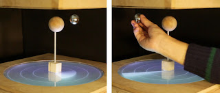 This system can be
used to demonstrate two ideas commonly used in physics: Kepler’s Law (left)
and the three-body problem (below). It can also be used to demonstrate two
concepts necessary for architectural planning: lighting control and camera path
control. The authors have “partially implemented and demonstrated a Tangible 3D
Pong application with the [ball] as a pingpong ball.”
This system can be
used to demonstrate two ideas commonly used in physics: Kepler’s Law (left)
and the three-body problem (below). It can also be used to demonstrate two
concepts necessary for architectural planning: lighting control and camera path
control. The authors have “partially implemented and demonstrated a Tangible 3D
Pong application with the [ball] as a pingpong ball.” A study was performed to evaluate the design. The users commented that the delay between
their action and the computers response was confusing. The users did like the
ability to place a ‘camera’ in the air and record the display from that angle. “Several
users commented that not being able to see physical relationship between ‘planets’
make them harder to expect how to interact with this system, or what would
happen if they touch and move the parts.”
A study was performed to evaluate the design. The users commented that the delay between
their action and the computers response was confusing. The users did like the
ability to place a ‘camera’ in the air and record the display from that angle. “Several
users commented that not being able to see physical relationship between ‘planets’
make them harder to expect how to interact with this system, or what would
happen if they touch and move the parts.”
Related Work
Evaluation
Discussion
ZeroN: Mid-Air Tangilbe Interaction Enabled by Computer
Controlled Magnetic Levitation
UIST 2011, October 2011, Santa Barbara, California, USA
Jinha Lee
·
MIT Media Laboratory
·
Ph.D. student and research
assistant
·
“He studies human computer
interaction and develops novel Tangible and Gestural Interfaces”
·
http://leejinha.com/
Rehmi Post
·
MIT Center for Bits and Atoms
·
Visiting
Scientist
·
His
research focuses on “dynamics of micro- and mesoscale systems, and microelectromechanical
systems (MEMS)”
·
http://web.media.mit.edu/~rehmi/bio.html
Hiroshi Ishii
·
MIT Media Laboratory
·
Associate Director of MIT Media Lab
·
His “research
focuses upon the design of seamless interfaces between humans, digital
information, and the physical environment”
·
http://web.media.mit.edu/~ishii/bio.html
Summary
“Tangible interfaces attempt to bridge the gap between
virtual and physical spaces by embodying the digital in the physical world.” Researchers are exploring how to transfer a
2D surface into a 3D interactive surface.
“Our goal is to allow users to take physical components of tabletop
tangible interfaces off the surface and place them in the air.” The first prototype created by the authors
used magnetic levitation technology.
Previous devices had input provided through manipulation of
physical objects and output through graphical projection. One approach to the transition from 2D to 3D
has been use of deformable surfaces. Holograms
have been considered for this technology but the user is not able to interact
with the holographic image like a physical object. “High performance magnetic levitation haptic
interfaces … enable the user to better interact with simulated virtual
environments.” “Our work aims to explore
a realm where both display and input occur in 3D space, mediated by a
computer-controlled tangible object, and therefore enabling users’ direct
manipulation.” The researchers “aim to
create a system where users can interact with 3D information through
manipulating computationally controlled physical objects, without physical
tethering by mechanical armatures or requiring users to wear an optical device
such as a head-mounted display.”
The system designed by the authors has a volume of “38cm x
38cm x 9cm in which it can levitate, sense and control the 3D position” of the
ball. The interactive space is larger
than that of the “anti-gravity” space to allow the users more range of motion. There are five key elements in the current
prototype: a magnetic levitator, a 2-axis linear actuator, stereo cameras, a
depth camera, and a tabletop interface. The
height of the object is achieved by “combining magnetic position control … and
mechanical actuation.” The lateral
motion in both directions is controlled by two stepper motors. “Properly measuring the distance of a magnet
is the key component is stable levitation and vertical control.” The levitating object is a spherical dipole
magnet. One of the challenges was to determine whether the motion of the object
in the “anti-gravity space” was being moved by the user or is “naturally wobbling.”
A Kinect camera was used to distinguish the users’ hands from the background. “When
the user grabs the [ball] and places it within the defined space of the system,
the system tracks the 3D position of the object, and determines if the user’s
hand is grabbing the [ball].”
The words that the authors use are place (putting the object
in its location), translate (move the object), rotate (rotating the object),
hold (holding or blocking the object’s motion), and long hold (initiates a
specific function such as replay). A
digital shadow was created so that the users have a visible link between the
object and the tabletop.
 This system can be
used to demonstrate two ideas commonly used in physics: Kepler’s Law (left)
and the three-body problem (below). It can also be used to demonstrate two
concepts necessary for architectural planning: lighting control and camera path
control. The authors have “partially implemented and demonstrated a Tangible 3D
Pong application with the [ball] as a pingpong ball.”
This system can be
used to demonstrate two ideas commonly used in physics: Kepler’s Law (left)
and the three-body problem (below). It can also be used to demonstrate two
concepts necessary for architectural planning: lighting control and camera path
control. The authors have “partially implemented and demonstrated a Tangible 3D
Pong application with the [ball] as a pingpong ball.” A study was performed to evaluate the design. The users commented that the delay between
their action and the computers response was confusing. The users did like the
ability to place a ‘camera’ in the air and record the display from that angle. “Several
users commented that not being able to see physical relationship between ‘planets’
make them harder to expect how to interact with this system, or what would
happen if they touch and move the parts.”
A study was performed to evaluate the design. The users commented that the delay between
their action and the computers response was confusing. The users did like the
ability to place a ‘camera’ in the air and record the display from that angle. “Several
users commented that not being able to see physical relationship between ‘planets’
make them harder to expect how to interact with this system, or what would
happen if they touch and move the parts.”
To increase the height of levitation, a cooling system would
need to be added to the current system. There is a limit to how quickly the ball
can be moved, if the acceleration is faster than the inertia of the ball can
handle, then the ball will be dropped. “Lateral
oscillation was reported as the biggest issue to correct in our application
scenarios.” The vertical actuation can
be increased by “carefully designing the magnetic controller with better range
sensing capabilities.” In future
designs, there will be capabilities to control more than one object at a time. The authors believe that this system could be
expanded to work with holographic displays also.
Related Work
1.
“Tangible bits: beyond pixels” – The
goal of this paper was discuss an application TUI and explain the various ways
in which it could be used.
2.
“Extending tangible interfaces for
education: digital montessori-inspired manipulatives” – This paper discusses ways
to classify “physical objects specifically
designed to foster learning” and discuss in detail the application of one of
the manipulatives.
3.
“New
Directions in 3D User Interfaces” – This paper discusses the history of 3D UI
and gives evidence of ways that new researchers can continue to expand this
field of research and ideas of how 3D UI can be used.
4.
“Interaction in a
collaborative augmented reality environment” – This paper details an augmented
reality system in which users interact with 2D and 3D data with tangible
interfaces.
5.
“3D User Interfaces: New Directions and Perspectives” – This paper covers
the current state of the art ideas in 3D UI and speculates of areas of future
research.
6.
“TUISTER: a tangible UI for hierarchical
structures” – This paper details the design of a tangible UI and explains how
it can be used with respect to hierarchical structures.
7.
“CUBIK: a bi-directional tangible modeling
interface” – This paper describes CUBIK with can be used to create and
manipulate 3D models.
8.
“iStuff: a physical user interface toolkit for
ubiquitous computing environments” – This paper covers “a physical
toolkit for distributed, heterogeneous environments with run-time retargetable
device data flow.”
9.
“Tiles: A Mixed Reality Authoring Interface” –
This paper introduces Tiles which is “a transparent user interface that allows
users to seamlessly interact with both virtual and physical objects.”
10.
“Developing a generic augmented-reality
interface” – This paper describes an augmented reality interface which would
allow the user to merge the virtual and physical space.
These papers clearly detail the fact that this
topic is not entirely novel, though parts of the ideas are new. Very few of the other papers were working
with magnets to create the 3D interface.
Overall, this topic can be considered novel since while others are
working on 3D interfaces, no one else is looking at this particular approach.
Evaluation
There were two evaluations performed on this system. The first was a subjective, qualitative
response of the users’ ideas on the system.
This is helpful, but could have been improved by an additional portion
of the responses which use a Likert scale. That would allow the users to
explain their disagreements and still have numerical data to use. The second evaluation was a testing of the
limits of the program; it was an objective, quantitative test. The limits were defined and then the authors
discussed whether the limits were effective enough or if they should be improved
upon. These evaluations helped the
authors come up with new ways to improve the system and fix any problems the
users found.
Discussion
I personally believe that this is an interesting, if not
entirely novel, idea. We will be seeing
more technology like this in the future.
The evaluation was appropriate, but I think using a Likert scale
questionnaire as well as an open response survey would have given more answers
which could be averaged. I would have
also liked to know how many users were involved in the testing that were not
involved in the creation of the system.
Overall, this topic is far from gone and will continue to be seen in the
future.
Wednesday, September 5, 2012
Paper Reading #5: Crossing Guard: Exploring Information Content in Navigation Aids for Visually Impaired Pededtrians
Intro
Crossing Guard: Exploring Information Content in Navigation Aids for Visually Impaired Pededtrians
CHI 2012, May 2012, Austin, Texas, USA
Richard T. Guy
· Department of Computer Science, University of Toronto
· Ph.D. candidate
· He “explores the possibilities of computational imaging for assistive and collaborative interaction.”
· http://www.cs.toronto.edu/~guy/
Khai N. Truong
· Department of Computer Science, University of Toronto
· Associate Professor
· His “research interests are in human-computer interaction (HCI) and ubiquitous computing (Ubicomp).”
· http://khaitruong.com/index.phtml
Related Work
Crossing Guard: Exploring Information Content in Navigation Aids for Visually Impaired Pededtrians
CHI 2012, May 2012, Austin, Texas, USA
Richard T. Guy
· Department of Computer Science, University of Toronto
· Ph.D. candidate
· He “explores the possibilities of computational imaging for assistive and collaborative interaction.”
· http://www.cs.toronto.edu/~guy/
Khai N. Truong
· Department of Computer Science, University of Toronto
· Associate Professor
· His “research interests are in human-computer interaction (HCI) and ubiquitous computing (Ubicomp).”
· http://khaitruong.com/index.phtml
Summary
The researchers are trying to solve the “problem of
orientation and mobility for visually impaired pedestrians by examining their
specific navigation needs.” Intersections are a point of stress, especially in
new areas. Feedback from visually impaired persons helped in the development of
CrossingGuard. The researchers performed a study to compare the information
given by CrossingGuard and in commercially available navigation tools.
Previous works have focused on orienting the impaired
person. A previous version allowed for dynamic rerouting around unexpected
delays. There are “several commercially available GPS navigation aids …
marketed directly to visually impaired people.” The designers need to know
exactly what information a visually impaired user needs for traversing an area
so that they can design effective tools. Recently, people have tried using
nonverbal audio and haptic feedback to provide information to impaired persons.
The ideas presented in this paper build upon some of the ones that have been
tested before.
The researchers held 2 structured interviews with 4 visually
impaired persons and 2 O&M specialists. “The first interview focused on the
strategies visually impaired pedestrians use to identify, navigate, and cross
both familiar and unfamiliar intersections.” The second interview “was focuses
on design criteria for a mobile navigation application.” Every participant stated
that they had trouble identifying alleys and driveways. Participants think that
“the device should include information about the shape of the intersection including
directions of available crossings, the width of streets, and the presence of
islands and other features of the roadway that affect crossing time” among
other things.
The CrossingGuard system provides “sidewalk to sidewalk”
directions for pedestrians with visual impairments. No novel ideas for
inputting the destination was explored due to the large numbers of previously
explored ideas. Users have simple gesture commands to support basic questions
such as “what is here?” A critical need for CrossingGuard is the interpreting
of data for use by visually impaired pedestrians. The prototype system was
based the OpenStreetMap project. The device describes each intersection based
on the number of streets in the intersection and the way in which they
intersect.
The researchers “designed a user study to test whether
having the more detailed information that CrossingGuard provides can raise the
comfort level of users as they prepare to cross an unfamiliar intersection
compared to base line information that is available on some commercially
available GPS navigation systems.” They
had 10 visually impaired people test the system, none of which had ever been in
the test area before. The participants were asked to describe the intersection
as they arrived and rate how comfortable they were with crossing the indicated
street on a 7 point Likert scale. After the walking was completed, the
participants were asked to participate in a brief follow-up interview.
The participants were asked “given the information you have
heard about this intersection, how comfortable do you feel crossing the street
here?” This showed that “having more
detailed information does increase comfort levels for visually impaired
pedestrians.” The participants were graded on the number of errors that were
committed along the route. According to the participants, “the shape, traffic
level, and traffic control device (light or stop) are the most salient features
of intersections.” Participants were asked to “rate the helpfulness of each
piece of information on a 7-point Likert scale.” The device pointed out when
alleys were present and most of the participants agreed with that feature. “A
common complaint was that intersections with very little traffic parallel to
the participant’s direction of travel were difficult to time.”
The researchers feel that “increasing comfort in new areas
is important because participants described feeling less comfortable traveling
to new areas or unfamiliar settings.” The participants offered suggestions for
people who are not advanced travelers. “Participants suggested that we extend
CrossingGuard to include the location of public transit stops and the location of
points of interest along the route.” Having the directions detailed by cardinal
directions confused some of the participants.
“To facilitate the collection of information that our
participants identified as most useful,” the designers developed a program
which would ask users to identify features of the intersection. Another way to
get additional information was the use of Mechanical Turk which has the users
answer questions about the intersection for a minimal payment. Mechanical Turk
users were able to easily answer some questions while others were more
consistently answered wrong. Figure 1 shows the kinds of information gathered by both of these applications.
 |
| Figure 1. |
“Navigation in new areas is a source of stress for visually
impaired people because they feel that they lack the information to travel
safely and confidently. The more information the participants had, the greater
their level of comfort.
Related Work
1.
“A New Approach for Pedestrian Navigation for Mobility
Impaired Users Based on Multimodal Annotation of Geographical Data” –
This paper focuses on a similar idea to CrossingGuard, the main difference is
that this research allows for the users to share data between them easily.
2.
“Pedestrian navigation aids: information requirements and
design implications” – This paper is all about the items that are
necessary to allow a person to navigate a new area; specific focus was not
given to those with visual impairments.
3.
“Cognitive Mapping and Wayfinding by Adults without Vision”
– This research is about the ways that visually impaired pedestrians create cognitive
maps of an area and how these skills are developed.
4.
“Understanding spatial concepts
at the geographic scale without the use of vision” – This article discusses the
way in which people with visual impairments understand geometric descriptions.
5.
“Navigation System for the Blind:
Auditory Display Modes and Guidance” – The idea behind this research is to
develop a “portable, self-contained system
that will allow visually impaired individuals to travel through familiar and
unfamiliar environments without the assistance of guides.”
6.
“From knowledge to words to wayfinding: Issues in the
production and comprehension of route directions” – This paper
discusses several of the problems associated with giving and understanding
directions.
7.
“Geography and the disabled: a survey with special
reference to vision impaired and blind populations” – This paper details some
of the basic problems that visually impaired people deal with daily and
provokes the reader to encourage the governments to make changes to help these
people get around in their daily life.
8.
“Exploring the Functional Specifications of a
Localized Wayfinding Verbal Aid for Blind Pedestrians: Simple and Structured
Urban Areas” – This paper proposes that a product highly similar to the one
discussed in CrossingGuard be created to increase the mobility of visually
impaired persons.
9.
“Non-Intrusive Somatosensory Navigation
Support for Blind Pedestrians” – This paper details a product that would allow
the visually impaired pedestrian to utilize their ears to hear what is around
them and keeps them on the correct path through the use of vibrators.
10.
“Verbal guidance rules for a localized wayfinding aid
intended for blind-pedestrians in urban areas” – This paper details
a few ideas for standardizing the information given to visually impaired
pedestrians.
As is clearly stated from the above listed papers, this idea is
not novel. There may be some parts which are more unique than others, but there
a large numbers of people trying to develop technology that will do exactly
what CrossingGuard does in the similar and different ways.Evaluation
There were two major forms of evaluation in this paper. The first was a qualitative, objective form
of evaluation on the number of errors made by the users. The second was a quantitative, subjective
form of evaluation; this was on the participant’s descriptions of the design. Each of these evaluation techniques was
effective, but I believe there could have been more numbers calculated and used
to evaluate the test. Overall, the users liked the material, but not everyone
agreed what was needed.
Discussion
I think that this paper covered a highly necessary piece of
research. Unfortunately, I do not
believe that the research done was entirely novel but the idea behind the
research is very helpful. As a human
being, I always feel better when I know the area where I am. I would imagine
that being blind would not change this for anyone. For that reason, I highly support the
research being done here.
Monday, September 3, 2012
Paper Reading #4: QuickDraw: Improving Drawing Experience for Geometric Diagrams
Intro
QuickDraw: Improving Drawing Experience for Geometric Diagrams
CHI 2012, May 2012, Austin, Texas, USA
Salman Cheema
· University of Central Florida
· Pursuing a Doctoral degree in Computer Science
· Area of primary interest is Computer Graphics.
· http://www.eecs.ucf.edu/isuelab/people/salman.php
Sumit Gulwani
· Microsoft Research
· Research interests are in the cross-disciplinary application areas of automating end-user programming
· http://research.microsoft.com/en-us/um/people/sumitg/
Joseph J. LaViola Jr.
· University of Central Florida
· “interests include pen-based computing, 3D user interfaces for games, human motion estimation, virtual reality, and interactive computer graphics”
· http://www.eecs.ucf.edu/~jjl/
Related Work
QuickDraw: Improving Drawing Experience for Geometric Diagrams
CHI 2012, May 2012, Austin, Texas, USA
Salman Cheema
· University of Central Florida
· Pursuing a Doctoral degree in Computer Science
· Area of primary interest is Computer Graphics.
· http://www.eecs.ucf.edu/isuelab/people/salman.php
Sumit Gulwani
· Microsoft Research
· Research interests are in the cross-disciplinary application areas of automating end-user programming
· http://research.microsoft.com/en-us/um/people/sumitg/
Joseph J. LaViola Jr.
· University of Central Florida
· “interests include pen-based computing, 3D user interfaces for games, human motion estimation, virtual reality, and interactive computer graphics”
· http://www.eecs.ucf.edu/~jjl/
Summary
Students and teachers in scientific disciplines often have
to draw very precise diagrams. “Our research goal is to investigate the use
of sketch-based interfaces for drawing precise diagrams since they can provide
significant benefits over existing tools.” QuickDraw is a prototype
sketch-based diagram drawing tool that allows the user to sketch and beautify a
given diagram.
“Sketch recognition is a hard problem due to the complexity
and variation in notation in different disciplines.” Techniques for sketch beautification have
also been explored by several researchers.
QuickDraw infers a user’s intent by recognizing constraints relating
sketched primitive components and uses this information to beautify the entire
sketch instead of just individual components.
In its current form QuickDraw can recognize and beautify
diagrams containing line segments and circles.
Recognition in QuickDraw is a two-step process: the sketch is parsed
into diagram (basic) components and the basic components are determined to be
line segments or circles. The inference
subsystem infers the intended constraints between recognized components. The beautification algorithm has two
interesting characteristics: robustness and interactive support. Users can sketch a drawing in two ways:
sketch the entire drawing and then trigger the recognize button or sketch
incrementally, hitting the recognize button after each step.
 |
| Figure 1. |
The users were to compare QuickDraw with traditional WIMP
based drawing tools. The researchers recruited a variety of people for the
study. Three levels of difficulty were
tested but users were not told the difficulty of the drawing being done. Figure
1 shows some of the figures tested by the users. The users filled out a pre and post
questionnaire and were given practice diagrams to familiarize themselves with
the programs.
The overall findings were: with easy difficulty, there was
only a difference between QuickDraw and PowerPoint and with medium and hard
difficulties, the only NON-different program was Geometry Expressions. Some of the factors affecting completion time
are: the order in which a tool is used, the drawing strategy: perfection or
not, quick or careful, triggering after the whole sketch is completed or after
each part, and incorrectly inferred constraints.
The first section asked participants to rate each
diagramming tool on a number of qualitative metrics. The second section contained questions
related only to QuickDraw. There were
significant differences for overall reaction, perceived drawing performance,
and the ability of each tool to enable easy diagram drawing. QuickDraw was better than PowerPoint, but not
than the other options.
Performance is hampered by three major factors: high failure
rate, lack of adequate editing capabilities, and drawing diagrams incrementally
inflates the completion time. In the future,
the authors would like to improve the editing abilities in QuickDraw, the inference
constraints by using classifiers over a variety of features and to extend the
constraint language to refer to virtual components.
Related Work
1.
“Sketch based interfaces: early processing for sketch understanding” –
This paper covers the topic of transforming a freehand sketch into a computer
model.
2.
“Sketched symbol recognition using Zernike moments” –
This paper covers recognition for hand drawn symbols in an online method.
3.
“A sketch-based interface for iterative design and analysis of 3D
objects” - This paper describes a program that works in conjunction with CAD to
make freehand sketch based engineering design.
4.
“Free-sketch recognition: putting the chi in
sketching” – This paper covers the difference between gesture based and free
sketch recognition techniques.
5.
“Sketch-based modeling: A survey” – This paper
covers the ideas behind mapping a 2D sketch to a 3D model.
6.
“Sim-U-Sketch: a sketch-based interface for
SimuLink” – This paper details an experimental sketch-based interface to
construct correct SimuLink models.
7.
“A Parsing Technique for Sketch Recognition Systems” – This paper covers “a
framework for modeling sketch languages and for generating parsers to recognize
them.”
8.
“Towards a computational model of sketching” –
This paper covers the need for computers to be as effective at sketching and
recognizing sketches as humans are. It
also poses several guidelines for determining when this happens.
9.
“Recognition of freehand sketches using mean
shift” – This paper proposes a “mean shift” method of sketch recognition. This method does not require any specific
knowledge, and thus can be applied to anything.
10.
“Beautifying sketching-based design tool
content: issues and experiences” – This paper covers a significant number of
problems posed by the beautification of a sketch. Several examples are given to explain better.
As is clearly obvious from the above listed papers, this topic is
not novel. The only novel thing about it
is using sketch recognition for strictly geometric diagrams.
Evaluation
The work was evaluated in a variety of ways. The users were evaluated with pre and post questionnaire
allowing for quantitative, subjective results.
These questions were based on how the user thought the study was
organized and what the user thought about the QuickDraw program. The researchers were also recording two
numbers which were quantitative, objective (the time and number of edits). These numbers allow the researchers to draw
conclusions that the questionnaires may not.
Because of the multiple types of evaluation, the data covers a large
amount of data and is more likely to be reproduced.
Discussion
This work is not entirely novel, it is being researched in a
variety of locations because of this it is interesting topic. The variety of people researching this topic
means there are a lot of possible solutions being created. Overall, the research was an interesting read
if nothing else. The evaluation done was
highly effective. It allowed for users
to be subjective in their results but still have the data be numerical. The variety in users could have been greater;
personally I think that you need more than 17 people to conduct a study. Also, women and men use programs differently
so I would have tried to include more women in the study.
Subscribe to:
Comments (Atom)